I have been working in the area of web and mobile applications for over 20 years and many years ago, the user experience was not mentioned as a separate issue requiring dedicated experts.
Although UX has been functioning as a term since the 1970s, work on the visual layer of the application was simply outsourced to graphic companies that focused on preparing a good appearance. The concept of customer experience did not work in projects.
The UX area slowly crept into front-end application projects, and currently UX specialists have dominated the design of mobile applications and there is a lot of talk about it while the knowledge and methodology of UX design are actively used in the creation of new banking applications for users.
Nevertheless, when using mobile applications in everyday banking, we encounter many inconvenient or counterintuitive solutions.
We wondered what these imperfections are caused by, since so much energy is spent on improving the quality of user experience?
So we decided to methodically verify the functionalities made available in banking mobile applications.
Do all applications have similar problems in similar areas? Do the complications only affect some of them? How are the various functional processes handled by the Banks?
We were interested in this, so we looked at 8 applications of the largest Polish banks, which covers approx. 14 million users which is about 80-90% of users of banking applications in Poland.
Taking a closer look at individual applications, we decided to present good and bad practices in the main functional areas of these applications.
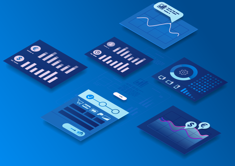
Functional areas
We plan reports on 6 main functional areas that are most often used by clients:
- Logging in and account balance before logging in
- Payments and other actions before logging in
- Main view/dashboard after logging in
- Account history
- Making a payment
- Payment card management
Experience analysis
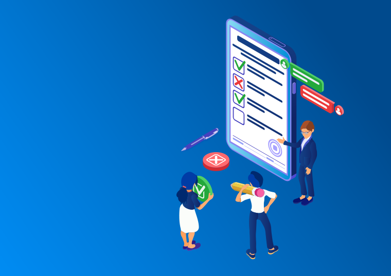
In the research, we focused on the customer experience related to the use of mobile applications.
We have described this experience focusing on the following areas:
- Peace of mind - the client does not want to have problems, does not want to risk a mistake, he wants to feel that he is in control of the situation, that he correctly uses the possibilities offered by the application. So we tested whether a given function clearly defines what the client can do at a given moment.
- Security - the client knows that his data and money are safe and that his orders will be carried out in accordance with his will.
- Ease of use / Convenience - the efficiency of the process itself, no effort or repetitive activities required.
At the moment, we present the first report on the functionality related to logging in to the mobile application and the account balance before logging in.
We invite you to read it as well as the individual reports for each application.
Subsequent reports will be out every 2-3 months.
How to use this report?
After the first report, we do not draw general conclusions, however, as part of the report for each area, we present successful solutions that are worth disseminating, as well as problematic ones, where we recommend changes.
We can already see that the variety of approaches to the same functionality is great. There is no one good way to implement a given functionality (for now, we can say about the login functionality), there are several good ones. Sometimes you are surprised by obvious UX errors (e.g. poorly visible basic Login buttons, no explanation of what the effect of performing a given action will be) or technical errors (e.g. turning on the biometric sensor too early, which causes an error to greet us). We can also see that some processes depend on the adopted level of security (e.g. whether the change of the login method is to be additionally confirmed or not - in two ways or the last used one?) which affects the comfort of use.
We encourage you to monitor our blog. Reports are divided into a descriptive part - substantive, which is the result of the analysis of all applications, and a part describing a given process - prepared loosely and with humor for each application separately. Despite the large overall volume of the reports, we focused on details. The reports can certainly inspire you to look again at the UX of the delivered applications. So we encourage bankers to get acquainted with them!